How do you design an editorial map for a travel magazine?
Generate the feature map from the travel brief in mapstudio.ai, bring it into the magazine style, hand it off to prepress as a CMYK PDF. Workflow for magazine editorial teams and freelance art directors.
Pay-per-download · Print-ready · Commercial license for print and digital
The short version
An editorial magazine map comes together in four steps: (1) enter the travel brief in mapstudio.ai (region, stops, story angle), (2) adjust style and color palette to the magazine's visual language, (3) fine-tune labels, routes, and emphasis, (4) export as a print-ready CMYK PDF. The AI handles geography and layout suggestions, the editorial team keeps full control of voice and typography.
Editorial travel map in four steps
- 01
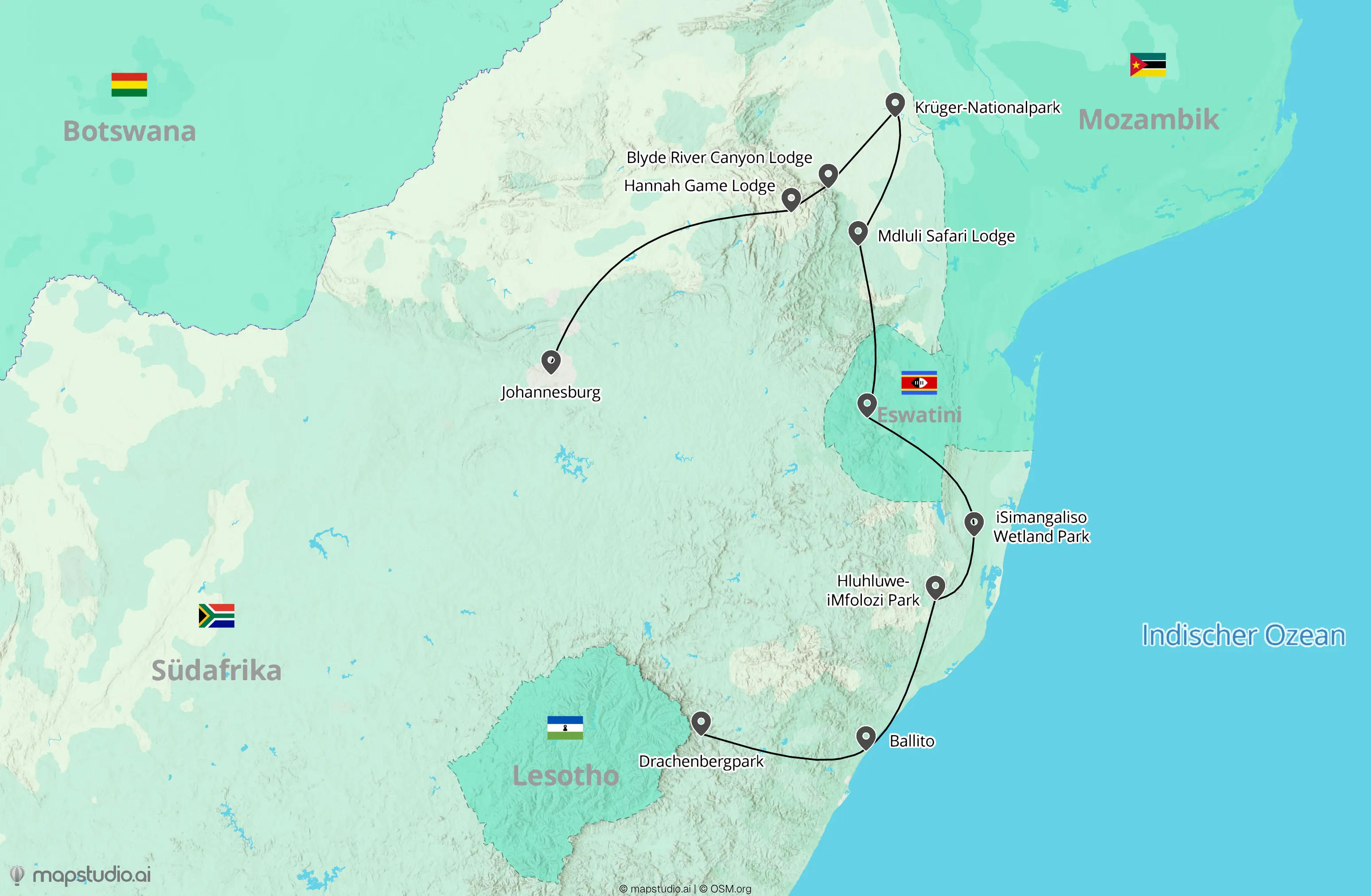
Travel brief from the editorial plan
When the feature is locked in, you usually already have a rough route (stops, highlights, region) in the editorial brief. Enter that in mapstudio.ai as text, plus story focus (e.g. "Mediterranean cruise, focus on port cities Genoa, Barcelona, and Athens").
- 02
Apply the magazine visual language
Pick Atlas, Relief, or Flat as the starting style. Adjust color palette and typography to the magazine's visual language, saved per workspace. All maps inside an issue or across a series stay consistent with the brand.
- 03
Edit labels editorially
In the editor, rename stops (proper names instead of geocoder defaults), adjust route weights, emphasize key locations. When the feature has a story arc (chapter stops), the map can mirror that arc visually.
- 04
Hand off print-ready to prepress
Export as CMYK PDF. Fonts embedded, print-grade resolution, ready for the printer. The PDF drops into InDesign or Affinity Publisher without post-processing in other tools.
What matters for editorial travel maps
Make the story arc visible
A good feature map narrates with the story. Main stops larger, side stops smaller. When the feature unfolds chronologically, the route line can support the reading arc (e.g. top-left to bottom-right).
Trim labels for tight layouts
Magazine layouts are tight on space. Instead of "Cinque Terre, National Park of the Italian Republic", "Cinque Terre" is enough. Detail belongs in the caption or body text, not on the map.
Match the style to the feature
A road-trip feature benefits from a warm Atlas style, a nature feature can lean on Relief, a modern travel-lifestyle magazine fits with Flat. If the magazine has a fixed style, save it per workspace.
Workspaces per series
If your magazine runs multiple series or sections (e.g. Travel + City), set up a workspace per series. Color palette and style stay consistent across all maps in the series, without re-configuring each time.